
Western Wings Upland Hunts
Brand Architecture • Website • Customer Strategy • Digital Presence • Sensory Design
Western Wings Upland Hunts
Western Wings Upland Hunts offers prime hunting land, experienced guides, and experienced dogs (English Pointers and German Shorthair Pointers). They know the excitement of dogs getting “birdie” and then suddenly turning to stone “on point.” And then there is the sound of flushing birds crashing through the cover and you take aim…what an experience! They wanted the Western Wings hunting experience to be something their customers always remember--and want to come back to.
WHAT WE DID
Brand Architecture • Website • Customer Strategy • Digital Presence • Sensory Design

The Challenge
Expand accessibility and overall brand exposure to increase and maximize customer acquisition, while communicating legitimacy in both expertise and in industry know-how.
The Goal
Modernize the digital customer experience.
Logo & Branding
Prior to partnership with Round Table Creative Consulting Firm, Western Wings' main channel for customer acquisition was through word-of-mouth and happenstance. We knew there was untapped potential and sought to revitalize the perception of Western Wings. We created a logo that is both aesthetically pleasing and clearly defined for the scope of services Western Wings offers.

Website
Responsive across every browser and platform allowing for unlimited access from any device. The website incorporates shades of green, outdoor textures, and design accents that give nod to the bird-hunting culture.


Check out the site
take a scroll on the wild side

The Voice & Tone
We developed the tone and messaging of the brand to resonate with the target customer.


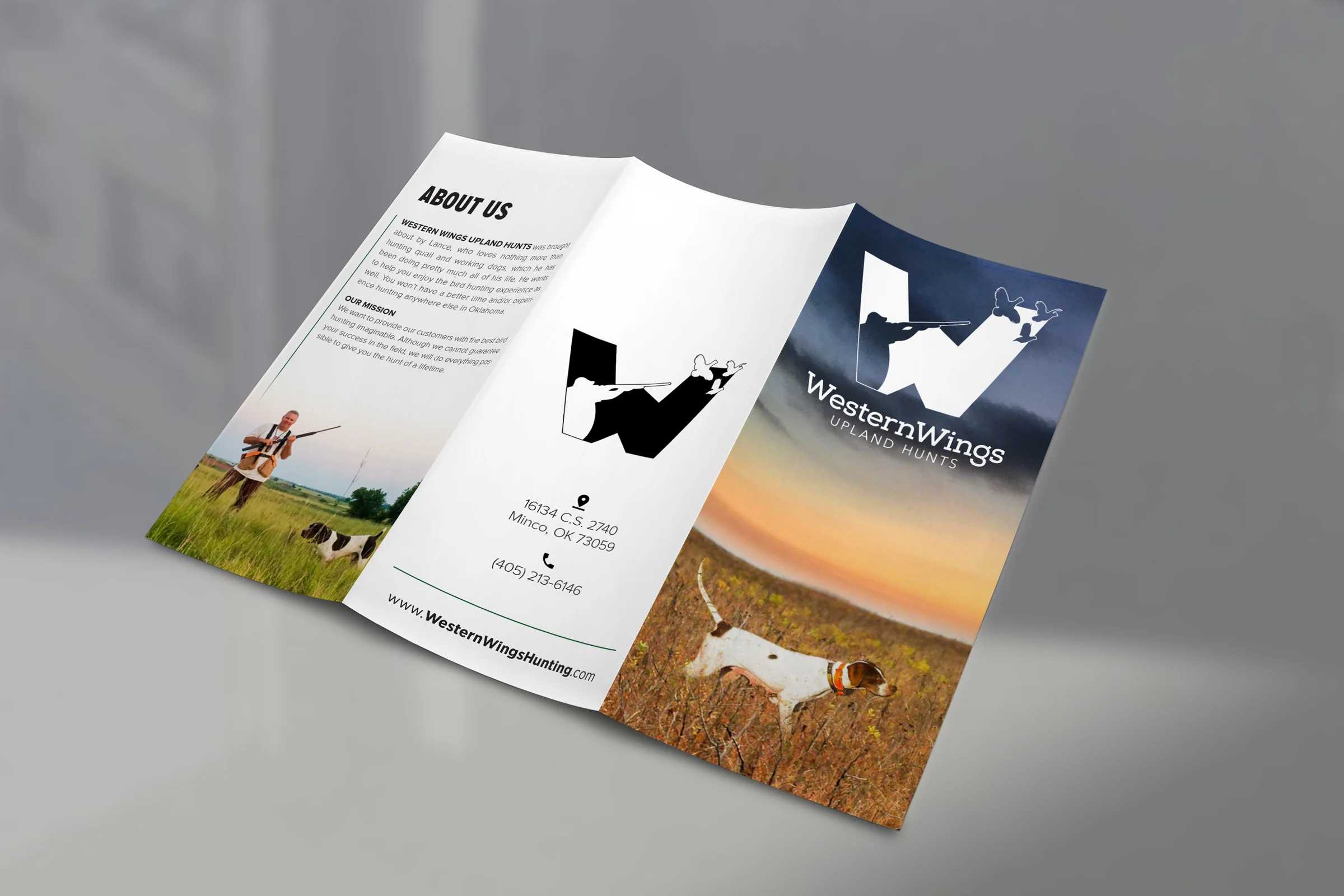
Print Material
Western Wing's former marketing materials were both dated and clearly from before the Dot Com Boom. We took this opportunity to elevate their brand above the other guys by completely refreshing and modernizing all print materials. We were sure to pay homage and respect to the styling on the website, in order to maintain a consistent and defined brand & identity.


< Last Case Study
Upward VR

Next Case Study >
PCC